Book design
Write a cover brief around the book and its readers
A cover brief gives a designer something more useful than a preferred colour. Explain the book, its readers and the decisions the cover has to support.
Book design
A cover can look clear at full size and lose its hierarchy in a small listing. Test what remains visible in the places readers will actually see it.
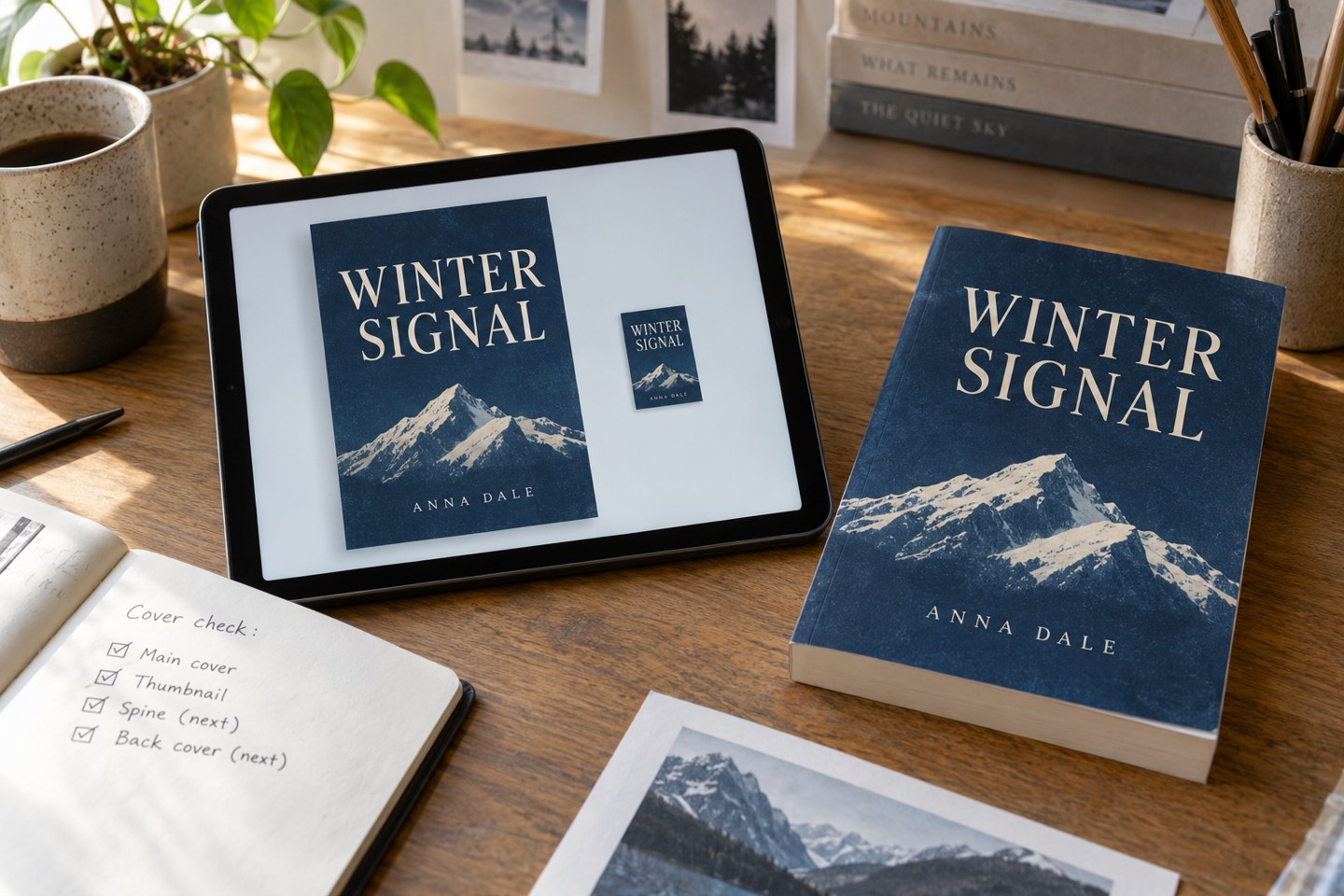
Export a reduced preview of the proposed front cover and view it beside other covers at a comparable scale. Keep the original proportions. Do not compensate by enlarging only the title in the test copy; the point is to inspect the design you intend to use.
Use more than one realistic viewing size. A shop listing, a phone screen and a promotional image may present the cover differently. There is no single thumbnail dimension that guarantees success everywhere. Recreate the context you care about, including the surrounding white space and neighbouring images.
Look away, then return to the group. Notice what you identify first. Can you locate the title? Does the image still suggest the right kind of book? Has a small detail turned into visual noise? Write down observations before deciding how to fix them.
Not everything on a cover must remain readable at its smallest appearance. A long endorsement or a small series note may be intended for closer inspection. The problem is when the main hierarchy disappears, leaving no clear way to recognise the book.
Ask another person to describe what they can see without supplying the title first. Knowing the wording makes it easier to read letters that are actually indistinct. Do not turn this into a popularity vote between unrelated concepts; ask a focused question about visibility or the impression of genre.
Check contrast and separation. A title that crosses a busy photograph may lose individual letters. A thin typeface can become weak when reduced. Two similarly sized lines may compete instead of forming a clear order. These are specific design problems you can discuss with the designer.
Test any revision at full size as well. Strengthening the thumbnail should not make the physical cover crude or unbalanced. The task is to find a hierarchy that survives different scales, not to optimise a tiny rectangle at the expense of the book itself.
Keep the final test image with the approved design notes, and check the actual listing after publication. A shop may crop or resize images differently from your mock-up. If the live image looks wrong, first determine whether the uploaded file, the site’s treatment or the design itself caused the problem.
Book design
A cover brief gives a designer something more useful than a preferred colour. Explain the book, its readers and the decisions the cover has to support.
Book design
Spine width depends on the finished physical book. A provisional page count is useful for planning, but the final cover must use the printer’s actual specification.