Book design
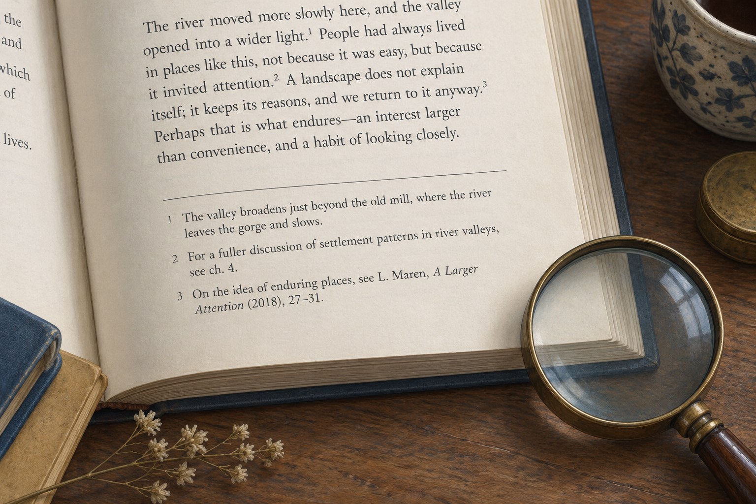
Footnotes need room to be read
Notes need a visible relationship with the text and enough space to be read without strain.
Book design
Reflowable books need a stable reading order, flexible spacing and testing at the reader’s chosen settings.

In a printed book, a designer can decide exactly where a paragraph ends on a page. A reflowable ebook gives some of that decision to the reading system and the reader. Screen dimensions, font choices, text size and spacing can all change the shape of a passage. Design therefore begins with relationships that survive those changes.
The heading must remain a heading when it moves. A caption must still belong to its image. A note link must return the reader to a useful place. A quotation should remain distinguishable without depending on a precisely measured patch of white space. These are structural requirements before they are visual preferences.
The EPUB specification distinguishes reflowable content from fixed-layout presentation. Neither format is a promise that every device will display a book identically. Choose according to what the content needs. A prose book usually benefits from flexibility, while a work whose meaning depends on exact spatial arrangements requires a more deliberate decision and accessibility review.
Use real headings, paragraphs, lists and other appropriate structures in the source. A line that merely looks like a heading because it is bold and large may not carry the same meaning through export. Consistent source styles make conversion easier to inspect and reduce the need for local repairs later.
Keep the reading order straightforward. If a print page contains a main paragraph, a sidebar, an image and a caption, decide the order in which those elements should be encountered when they become one sequence. “It sits on the right” is not a useful answer in a format that may not have a right-hand column.
For a hypothetical craft book, an instruction should introduce the diagram before asking the reader to interpret it. Its caption should follow the image closely. A separate safety qualification essential to the instruction belongs in the reading flow, rather than in a box whose position is only meaningful in print. Resolve these relationships in the manuscript before fine-tuning the ebook's appearance.
Avoid using repeated spaces, tabs or empty paragraphs to position text. They can produce unexpected gaps or collisions when a reading system changes the font. Do not simulate a new page by adding many blank lines. Use the structural and styling features supported by the ebook workflow, then test the resulting file.
References such as “see the opposite page” become unreliable when pages move. Refer to a named section, figure or linked destination instead. If a print page reference is retained for a meaningful reason, make clear what edition it refers to and consider an accompanying link. The reference should help someone reading only the digital edition.
Images should remain legible on small screens and avoid forcing the entire book into a rigid width. Test diagrams with small labels, wide tables and images containing text separately. A drawing that occupies half a printed spread may require a larger digital presentation or an additional text explanation. Do not assume a reader can comfortably zoom every object.
Open the exported ebook in more than one appropriate reading system. Increase text size substantially, change orientation if available and try a narrower reading area. Inspect chapter openings, long quotations, lists, notes and the final pages. The default display is only one possible encounter with the book.
Watch for clipped text, unwanted horizontal scrolling, images detached from their captions and headings stranded after large gaps. Some variation between readers is expected; loss of content or meaning is not. Record the device or application, setting and exact location of each problem so that a correction can be retested under the same conditions.
Validation tools can identify structural problems, but they do not replace reading. A technically valid file can still have confusing navigation, awkward image placement or an illogical reading order. Likewise, a file that looks convincing in one preview may contain an error that appears elsewhere.
Keep a short note of deliberate differences between the print and ebook editions. A wide table may become two smaller tables; an endnote may acquire a return link; a decorative divider may be simplified. These are production choices that should be checked against the same editorial meaning.
The most resilient ebook design lets the reader alter the surface without losing the book's organisation. Approve it when the structure remains clear under uncomfortable settings, not only when the typography resembles the printed edition on your own screen.