Book design
Tables that remain readable on the page
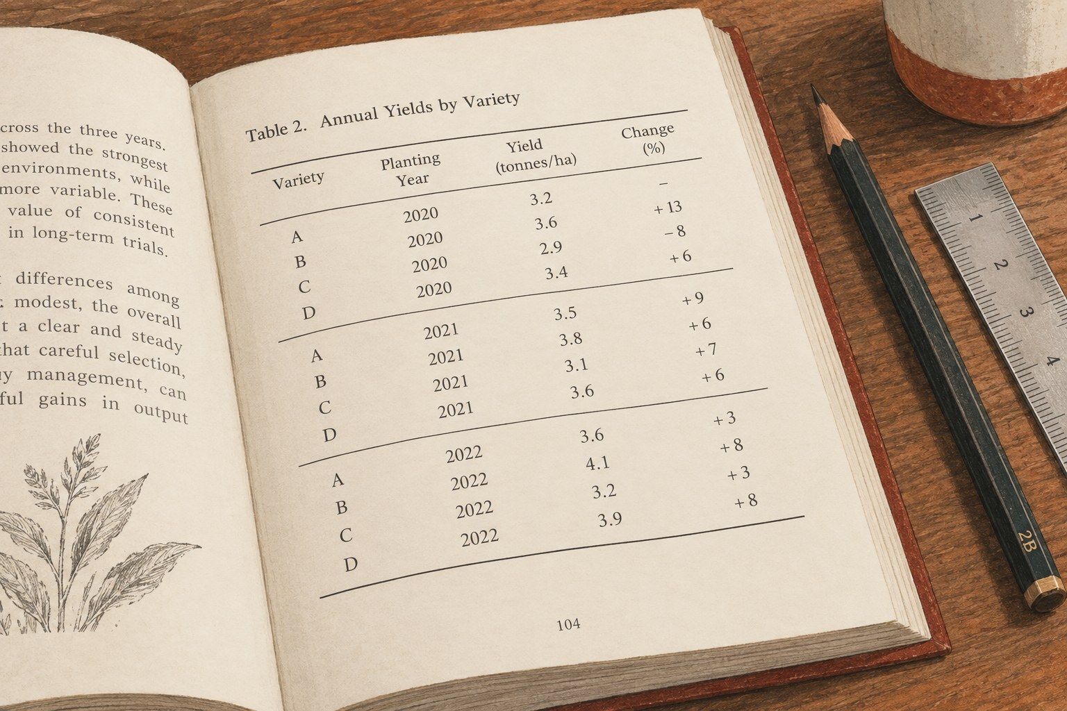
A useful table lets readers compare the right things without turning the page into a wall of rules.
Book design
Notes need a visible relationship with the text and enough space to be read without strain.
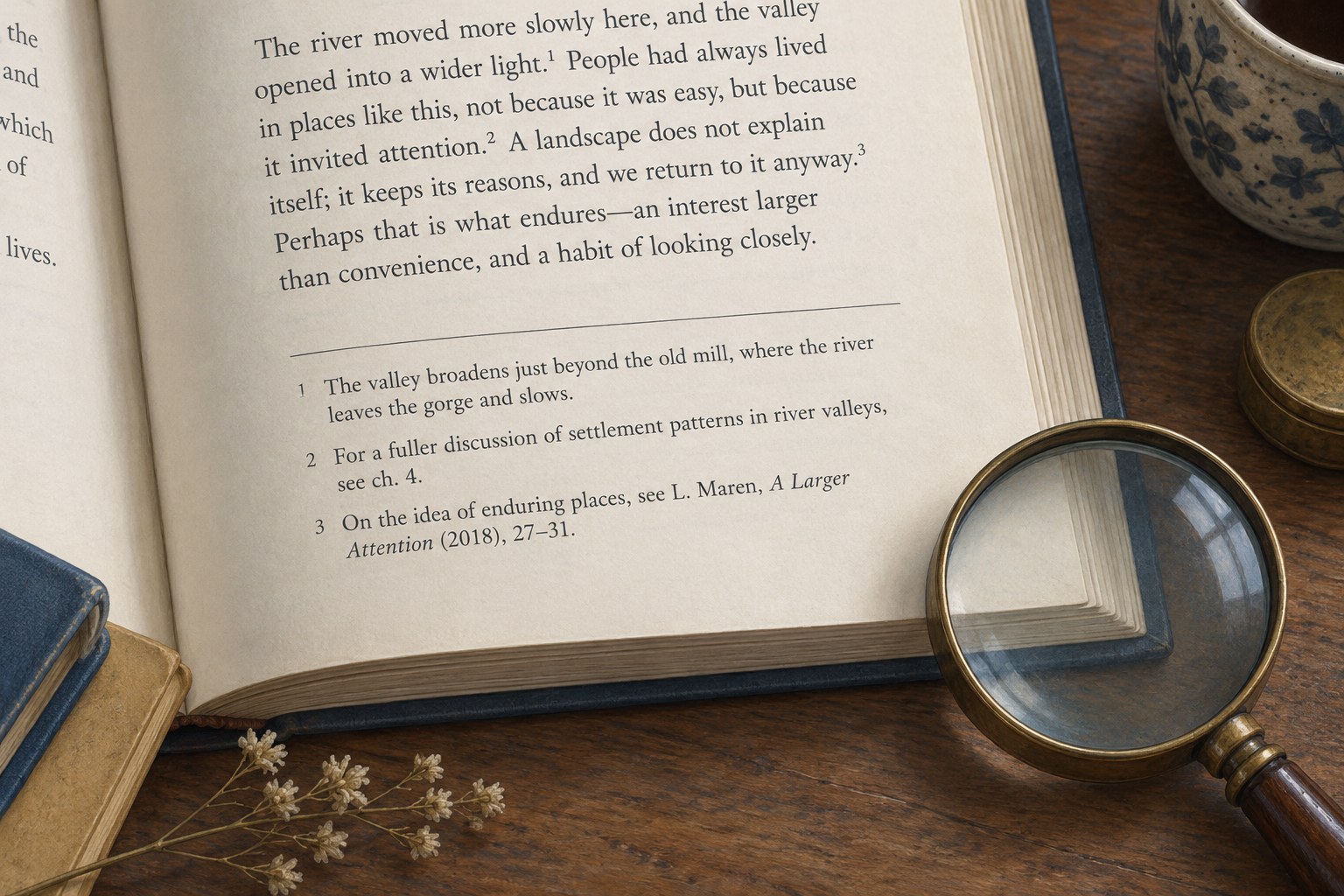
Footnotes ask a reader to leave one reading path and enter another. That interruption may be worthwhile for a source, a qualification or a short explanation. It becomes tiring when the note contains material essential to understanding the sentence above it. Before adjusting the page, check whether the information belongs in the main text.
A historical date supported by a source reference can sit comfortably in a note. A definition that the next five paragraphs rely on usually deserves a place in the paragraph itself. An interesting but lengthy aside may work better elsewhere. These decisions reduce pressure on the layout without disguising necessary information in smaller type.
Use a consistent marker system and keep markers attached to the appropriate words or punctuation according to the chosen style. A marker stranded at the beginning of a line is difficult to interpret. After revisions, inspect places where sentences have moved, since a note can remain attached to text that no longer makes the claim it originally supported.
Use the document's note tools where the workflow supports them. Adobe's InDesign documentation describes linked reference numbers and note text with automatic numbering. That connection is safer to maintain than a manually typed superscript and a separate text box, although imported notes and unusual layouts still need checking.
The note itself needs a readable type size, spacing and line length. “Smaller than the body text” is a relationship, not a specification. Print a dense sample page at actual size, including the smallest note text, to judge whether it remains comfortable for the intended audience and paper.
A book's quiet pages can make almost any note style look successful. Test the pages with several references, a long quotation and a substantial note. Look for a clear division between text and notes, enough breathing room and a stable rhythm across the spread. A fine separator can help, but it should not be expected to rescue an overloaded page.
Check whether long notes split and how continuation is indicated. A note ending halfway through an explanation at the bottom of a right-hand page can be awkward to follow. Some splits are unavoidable; the aim is to make the continuation intelligible rather than to force every note into a single page at any cost.
After corrections, verify marker order, note content and placement together. Do not check numbering in one file and wording in another. Search for empty notes, duplicated markers and unresolved editorial queries. When a note cites a source, confirm that its reference still matches the surrounding claim.
If the digital edition uses endnotes with return links, test the outward and return journeys on an actual reading system. The print edition's bottom-of-page relationship cannot simply be assumed in a reflowable book. In either format, the reader should be able to find the extra information and return to the sentence without losing their place.