Book design
What colour can hide in a black-and-white image
Colour differences can disappear in monochrome. Check the information as well as the appearance.
Book design
A useful table lets readers compare the right things without turning the page into a wall of rules.
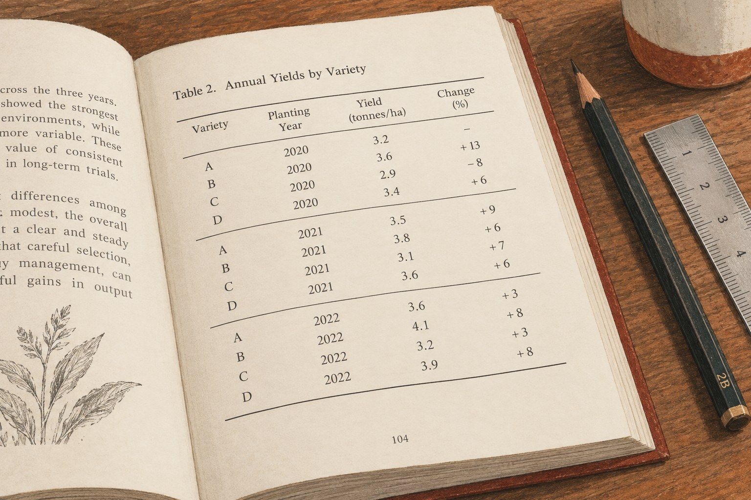
A table is a small reading system. Its columns promise that items belong together, its rows connect observations, and its labels explain what each value means. Before changing the typography, write down the comparison the table is supposed to make. If that sentence remains vague, a cleaner design alone will not solve the problem.
Consider a hypothetical guide comparing three kinds of notebook binding. Readers may need to compare how each opens, how easily pages can be removed and whether it lies flat. Those are useful column headings. Mixing a historical anecdote, a price estimate and an unrelated manufacturing detail into the same row produces a table that is difficult to scan even when it fits beautifully.
Sometimes prose or a short list communicates better. A table with two items and several empty cells may be an unnecessarily elaborate container. A table with long paragraphs in every cell may need to become separate descriptions. Keep the table when alignment itself helps the reader notice a relationship.
Place the longest likely entries into a sample before setting column widths. Short placeholder words hide the pressure that real content will create. Give explanatory labels enough space, then distribute the remaining width according to the data. Equal-width columns can look orderly but waste room when one contains a single number and another contains a phrase.
Reduce wording before reducing type. A repeated unit can often move to the column heading. A phrase can become shorter without losing its meaning. However, abbreviations that require constant decoding simply transfer the burden to the reader. Define an unfamiliar abbreviation close to the table, and use it only when it genuinely saves space.
If the table still does not fit, reconsider its structure. Split it by a meaningful group, move a secondary comparison into another table, or discuss a landscape page with the designer. Shrinking every cell until the page looks tidy may create an object that technically fits but cannot comfortably be read.
Align text labels consistently so readers can find the beginnings of words. Align comparable numbers so their magnitudes are easy to compare; decimal alignment is useful when decimal places matter. Do not mix a percentage, a count and a written qualification under a heading that implies one consistent measure.
Check the precision of the values as an editorial question. Displaying one item as 4 and another as 4.000 can suggest a difference in measurement that does not exist. Keep the chosen precision consistent with the underlying evidence. If a value is unavailable, distinguish that state from zero and explain the convention.
Rules and shading should support these relationships. A few horizontal rules may be enough to separate the header and major groups. Dense vertical grids can compete with the text. Alternating row shading can help a reader follow a wide table, but it should remain distinguishable in the intended print process and should not be the only way to understand a grouping.
A table that spans pages needs repeated headers and a clear indication of continuation where necessary. The reader should not have to turn back to remember what the third column measures. Keep related rows together when separation would create a misleading comparison. Examine every actual break; an application cannot always know which relationship is editorially important.
Software support affects implementation. InDesign provides table headers and footers, but its documentation also notes limitations around adding footnotes inside tables. Decide how source notes and qualifications will be represented in your production workflow instead of assuming that ordinary body-text note behaviour carries across unchanged.
Place the caption and explanatory notes close enough to be found. A note that changes the interpretation of every value should not become an obscure symbol on a distant page. When a table supports an argument, the surrounding paragraph should explain the significant comparison rather than merely telling readers that a table exists.
Check every row against the source data after layout. Copying and reordering can detach a value from its label without producing a visible typographic error. Then print the table at its final size and try the intended comparison without referring to your working files.
For an ebook edition, test whether the table remains usable at narrow widths and enlarged text. A print solution may need a different digital treatment, such as smaller related tables or a text explanation. Preserve the relationships and labels across editions, even when the geometry changes. The table is finished when a reader can make the comparison accurately, not merely when the last column fits.