Book design
Choose body type for sustained reading
Body type has to work across many pages, not only in a specimen sentence. Compare candidates using the actual prose and the characters the book needs.
Book design
Type size, line length and line spacing work together. Change them as a system and compare printed samples before settling the reading page.
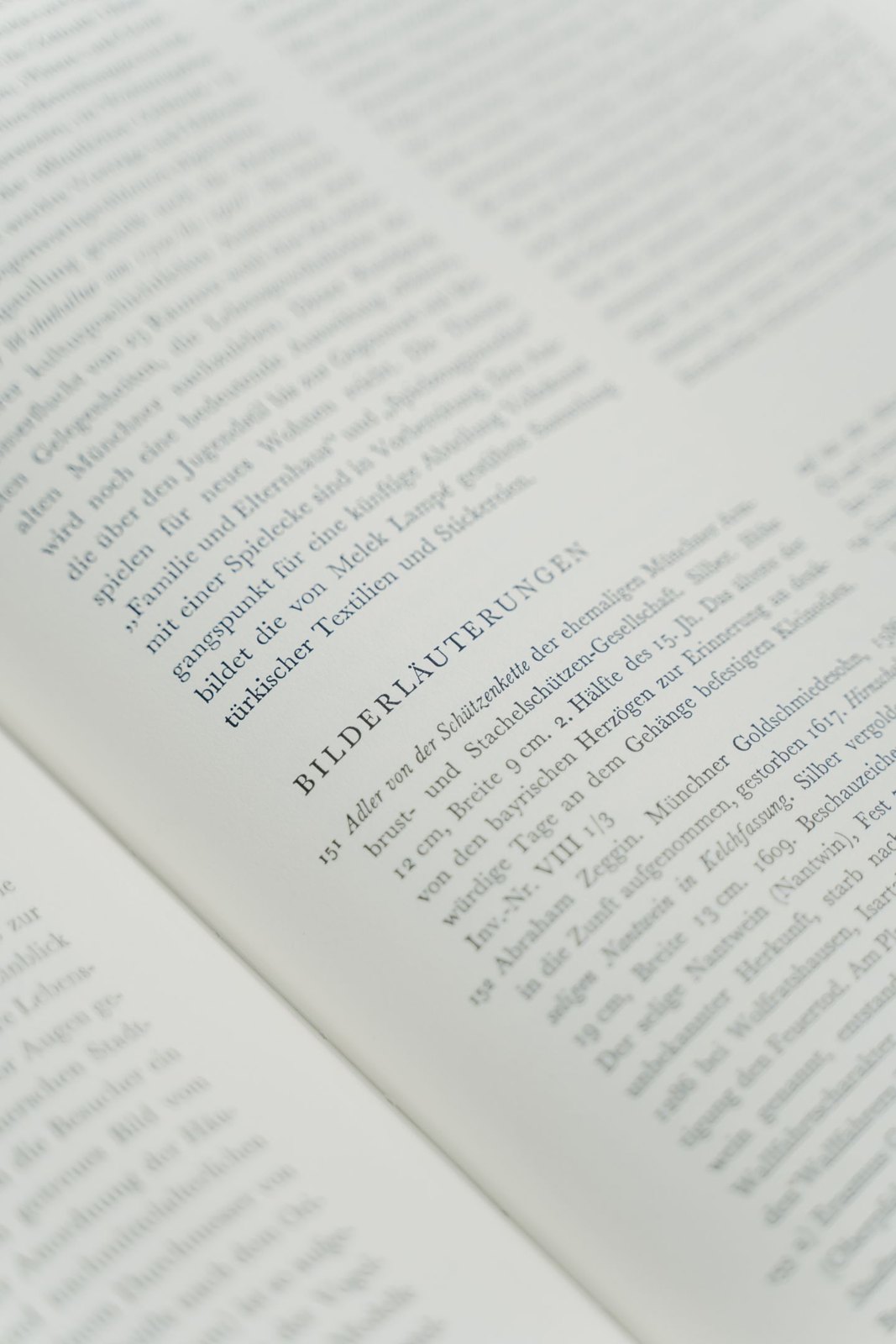
A line can look attractive on its own while producing a tiring page. Set several paragraphs of representative text, including short and long sentences. Read them continuously. You are testing how the eye travels across a line and finds the beginning of the next, not simply whether the letters are large enough.
Start with a plausible body type and page format, then compare a few combinations. Keep a note of the type size, line spacing and text-block width for each. Change one setting at a time where possible so you can identify the cause of an improvement.
Point size alone does not describe the apparent size of the text. Different typefaces occupy that size differently, and the weight and spacing of their forms affect the page. Avoid treating a number copied from another book as a complete specification.
Long lines can make returning to the next line harder; very short lines can create frequent breaks and awkward spacing. The effect depends on the text and type. Compare a wider and narrower setting using the same passage, then note where your reading starts to feel interrupted.
Line spacing also changes the visual relationship between lines. Too little can make a paragraph feel compressed, while too much can weaken the sense that its lines belong together. Inspect ascenders, descenders, italics and any special characters used in the actual manuscript.
Check the difference between paragraphs. If spacing between lines and spacing between paragraphs become too similar, the structure can be difficult to recognise. Decide how paragraph openings are signalled and apply the system consistently rather than accumulating extra blank lines during layout.
Print the strongest candidates at actual size. Read a full spread, then inspect a page with notes, a table or another demanding element. A setting that works for ordinary prose may need a related secondary style for these components.
Look at the overall texture: conspicuous gaps, very dark paragraphs, uneven line endings or an excessive number of short final lines. Some issues may arise from justification or hyphenation rather than the basic size and spacing. Diagnose the cause before changing several settings at once.
Once the combination works, put it into paragraph styles and use it through a longer sample chapter. Review the resulting page count and chapter endings, but do not let a target length erase the reading benefit you have just established. If production constraints require a change, compare another complete sample instead of squeezing isolated pages until they fit.
Book design
Body type has to work across many pages, not only in a specimen sentence. Compare candidates using the actual prose and the characters the book needs.
Book design
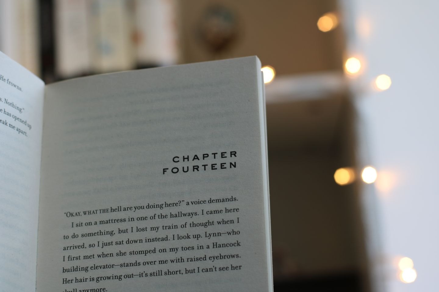
A chapter opening should make the transition clear and belong to the rest of the book. Build it around the actual heading material, including the awkward cases.